UofT RSX Brand Redesign
May 2025 - August 2025


Over the summer, I appointed myself the role of Redesign Lead and completely overhauled the design and brand identity for UofT's Robotics for Space Exploration design team.
This involved creating:
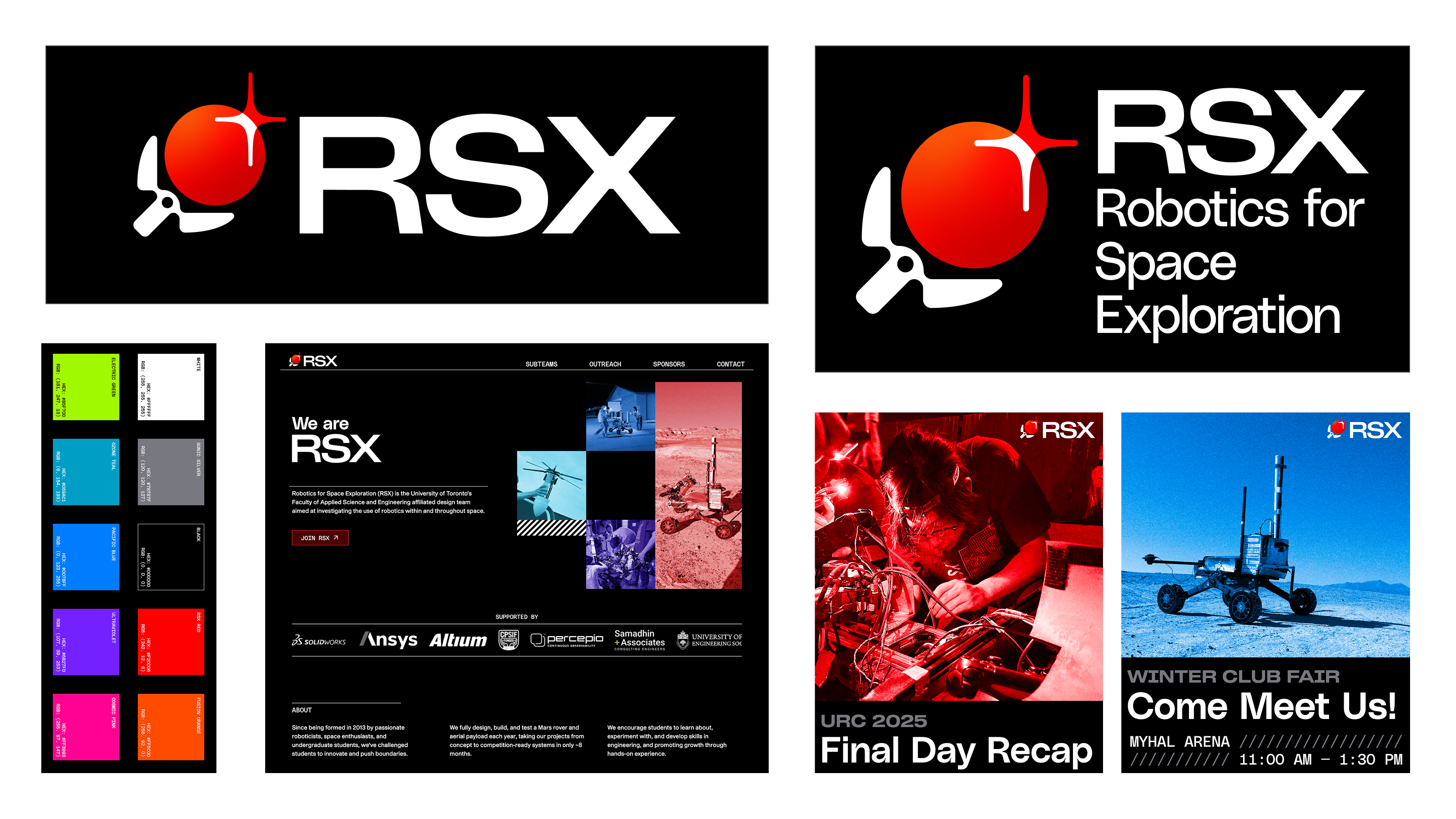
- A new set of logos
- A comprehensive style guide for current and future marketing members to reference, compiling all the logos, colours, typography, as well as examples and best practices
- A complete "starting from nothing" rebuild of the website, done in Svelte, and deployed on Cloudflare Pages
Logo
The logo was by far the most challenging and time consuming portion of the redesign. While I landed on a decision regarding the fonts and layout of the lockup fairly early on in the process, I was still working on the icon into August.
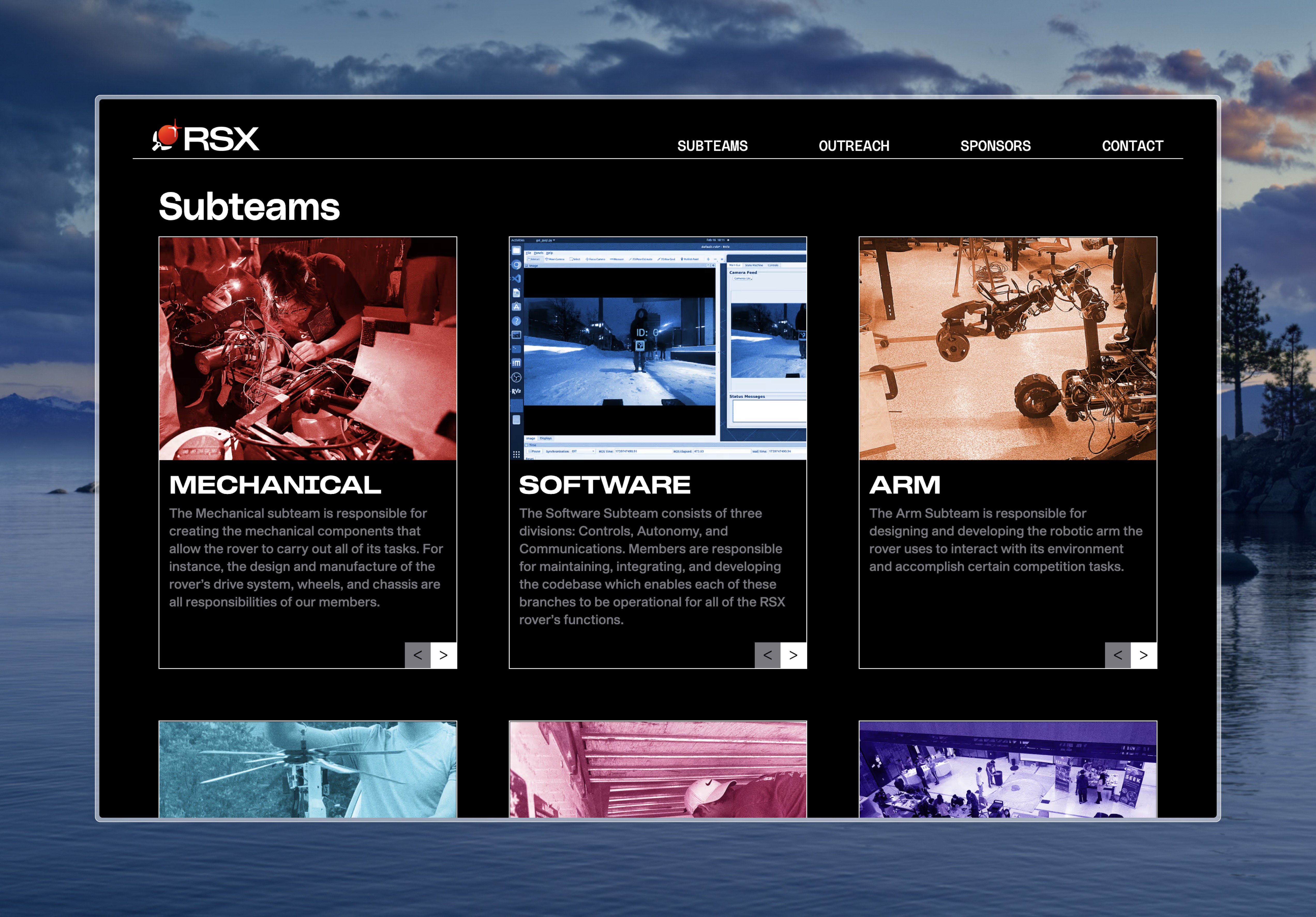
In recent years, RSX has started to expand in scope. Instead of simply being a Mars rover design team, composed of the mechanical, electrical, software, science, and arm subteams, we also house RSX Aerial, which competes in the CANSAT Competition and I'm the Jr Lead of, as well as a drone team, which is developing a drone for the rover's mission, and a drone for the Aerial team's drop testing.
My challenge was creating a logo that incorporated the themes of robotics and space, representing the whole of the team, without leaning too hard into the Mars rover imagery, or over-representing space exploration and under-representing robotics.
This was especially a problem in my early iterations, where I focused on the rover wheel or lone space imagery. I think the logo I landed on strikes a good balance and accurately represents RSX, while leaving room for the team to grow or evolve over time.

The primary lockup/logo

The secondary lockup/logo
Brand Guide
The brand guide serves to compile the core of the new brand identity into a single document that future marketing members will be able to reference, ensuring that a consistent through-line is maintained in our visual identity, and that even unexperienced members can contribute content for our social channels and stay on theme.
The following is taken directly from the Branding Style Guide:
RSX’s visual language is meant to be one that reflects the broader spirit of its best members. The shapes are razor- sharp. The colours are bright, punchy, and energetic. The type is bold and often in all-caps, looking as though it could support its own weight. The language of this new design isn’t afraid to be in-your-face. It’s unabashedly itself.

"The colours are bright, punchy, and energetic"
Images
I also wanted the images we use to match this theme and follow in the same philosophy. In order to try different image effects and experiment with how I could edit images to feel cohesive within the team's visual identity, I developed a small web app, dithertool.
I experimented with using a Bayer matrix dither effect, however this caused a moiré effect at certain scales and was incredibly lossy when considering the actual content of the images. I also tried many other dithering algorithms and combinations of colours, scales, effects, etc. I wasn't very satisfied with any of them.
Instead, I ended up landing on a tined grain effect. This preserves detail and the information/content of the image very well, yet allows for extremely customizable styling that perfectly compliments the team's visual identity.

An example post using the tinted grain effect
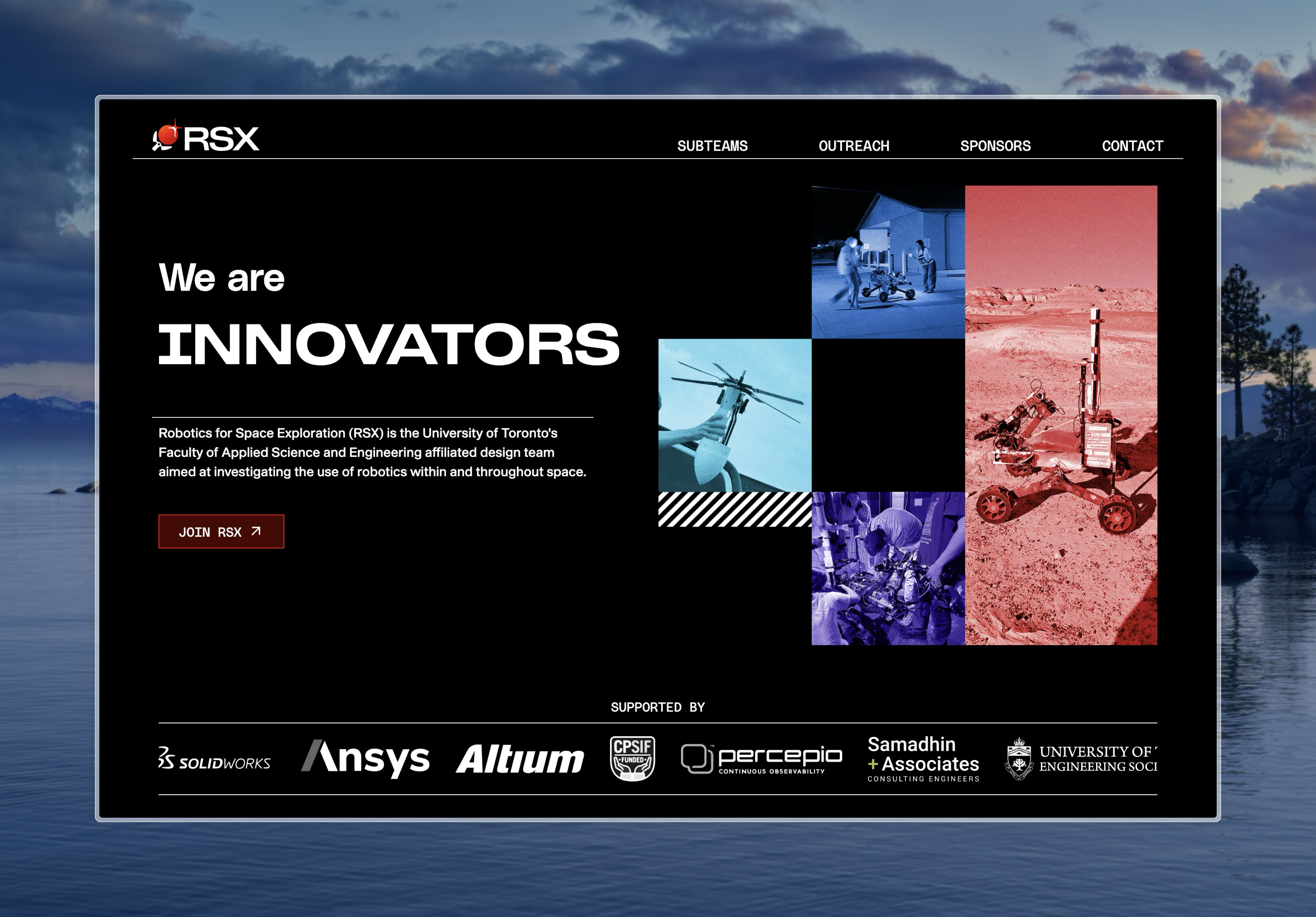
Website
The website was the largest implementation of the brand identity and was the proving ground for the broader redesign.
I used Svelte due to its commitment to performance and simplicity, which will likely be easier to maintain for future marketing teams than if I used something like React, while still providing some much-appreciated conveniences that make development much easier.
The website itself is just hosted using nginx on a Oracle OCI free tier VPS. I initially wanted to—and did—use Cloudflare Workers due to their speed (and being free didn't hurt), but Workers doesn't support custom subdomains outside Cloudflare zones, which is crucial to be able to use our rsx.skule.ca subdomain. I then tried Cloudflare Pages, but due to DNS issues beyond my control, had to just resort to the nginx VPS.
In order to easily update the site myself, as well as make it as simple as possible for future marketing members/webmasters to update the site, I also setup a very rudementary CI/CD pipeline, identical to the one I use for my personal website. When someone pushes to the GitHub, it will build the site, copy it over via SCP, and restart the node server with SSH.
This also solves another problem I was having, as due to the VPS being on the free tier, it runs out of RAM while building the website. I also tried adding 2 gigs of swap memory to fix this, but immediately realized it was too slow to be practical, with builds taking excrutiatingly long. The GitHub action does take ~3-4 minutes from start to finish, which leaves much to be desired, but is still much faster than building directly on the VPS ever was or could be. I'd like to get this time down in the future, but for now it works, and waiting a few minutes for the website to be updated globally isn't a huge issue.
For analytics, I also setup PostHog and a Cloudflare Worker as a reverse proxy, as adblockers have chosen to filter out calls to PostHog's domains :/